Contents
Things I did n't include in the main design document for sake of brevity.
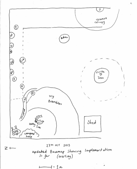
1. Updated base map showing first plantings October 2013.
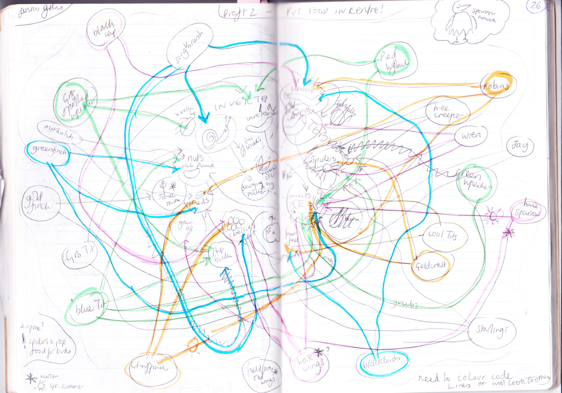
2. Bird food web, rough draftts
3. Evaluation of food web
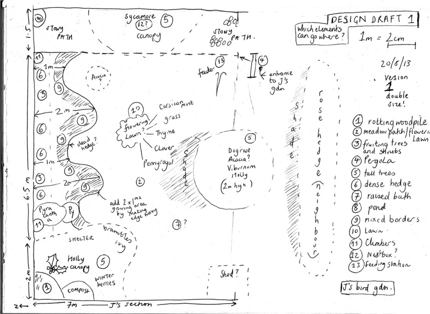
4. Design draft 1
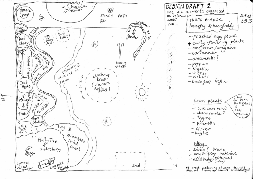
5. Design draft 2
6. Peer evaluation March 2015
1. Updated base map showing first plantings October 2013.
2. Bird food web, rough draftts
3. Evaluation of food web
4. Design draft 1
5. Design draft 2
6. Peer evaluation March 2015
1. Updated base map October 2013
2. Bird food web - rough draft
3. Evaluation of bird food web
Plus
Plus
- shows how vital berries and insects are to diet of many birds.
- enjoyed sketching the birds (from RSPB book of British Birds mainly)
- more space required in centre, bit Clapham Junction
- other predators not included - squirrels, cats, crows and magpies
- Reminded me of children's song 'There was an old lady who swallowed a fly!' - the web of life in this fairly modern nursery rhyme.
- This web would vary from region to region, depending on how rural/urban. Also would need to check and update each year as garden changes.
4. Design draft 1 in black and white
5. Design draft 2 showing specific plantings
6. Peer evaluation March 2015
Here is some feedback from Juliet which I found extremely helpful:
One general presentation comment: your purple highlighting is a bit
confusing as it looks like 'link' text but isn't (I kept running my
mouse over it looking for links!). You could consider using italic /
underline / bold instead if you want to emphasise things, and consider
which things really need emphasis.
Gather info section:
- Current arrangements: some of this is reproduced in the base map so
maybe don't need to reiterate it?
- For easier reading, see if you can standardise how you present the
different sub-sections; currently there are a couple of different
sizes/fonts of heading.
Summary of Aims
- Should the 'hedge food' point be a bullet point?
You repeate 'gather info' several times (above client interview,
boundaries, resources, etc). I think it would be clearer if you only had
it once, then used sub-headings for the various sub-sections of
information gathering.
Boundaries:
- base maps are lovely! And the photos give a nice idea of the site.
Birds' Needs
- table & especially food web are great. I really love the food web.
- again though maybe look at consistency of how the information is
appearing on the page (fonts / font size / alignment / etc).
Evaluation:
- should you have mentioned anything about managing the competitors /
predators? If there's nothing to be done about them then that might be
worth mentioning too.
Ideas: this is great.
Integration / design: looks fab! Very clear.
Implementing the design:
- again weird font sizes etc so check this.
- could you use a table to make it clearer?
- could implementation plan and what actually happened be integrated
into the same section?
- I love all the photos.
- no need to apologise when there aren't any photos :)
- some of the observation/implementation notes could maybe be trimmed a
bit. They're interesting but there is a lot of information here... Or
put this section on another page and link to it as an 'implementation
diary' -- kind of as supporting documentation.
Reflections/etc: very thorough & interesting!
Looks like a gorgeous garden, well done!
I have been able to rejig the design to follow the above suggestions, (Accept feedback and apply self regulation) especially the Implementation Diary and Implementation table to make stuff clearer.
Though can't get rid of blue font as it's allover portfolio and draws attention to the permaculture in the designs. I'm sure receiving this feedback 'll save me a bit of work further down the line... so thank you Juliet!
